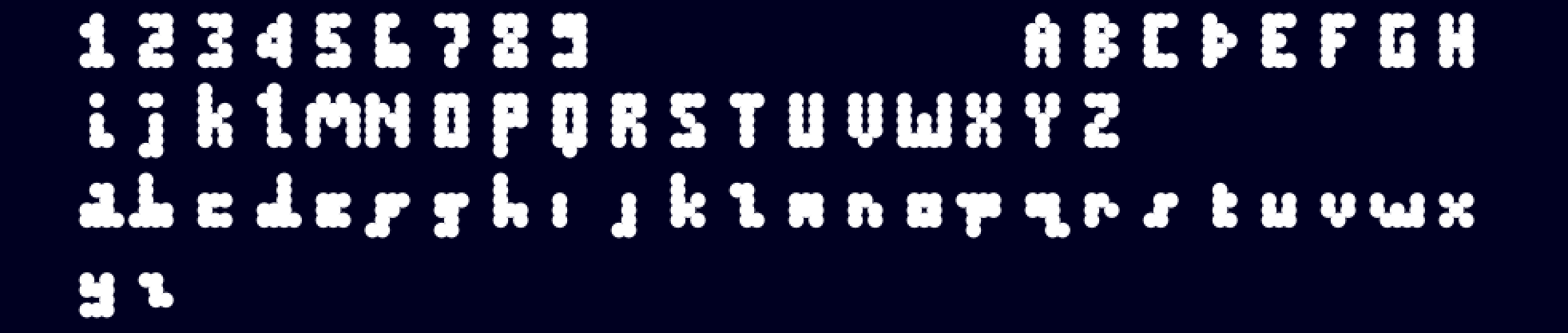
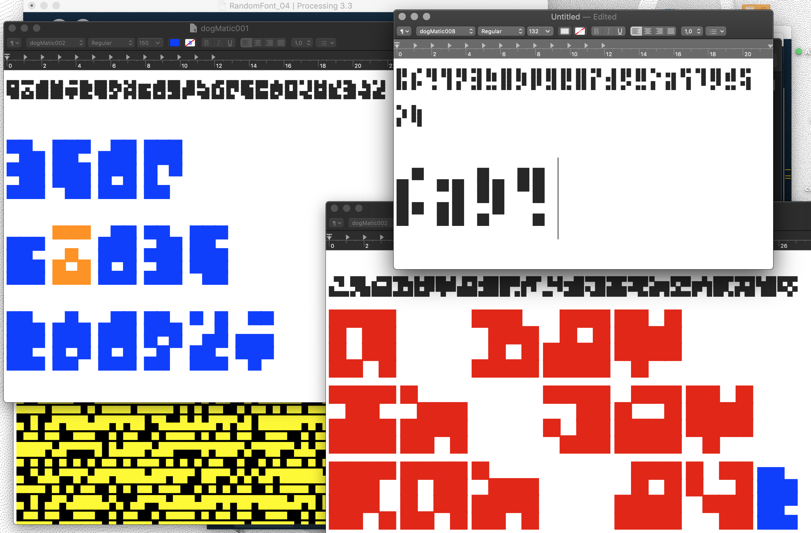
alphabet proto_001.
George & Friends is a research project led by Simon Renaud and Mark Webster that explores letter form through non standard means. The objective is to propose other ways of thinking about type design and to open up the field to further experimentation. This is a visual research site on which we will publish on-going images and texts that inform our enquiries.
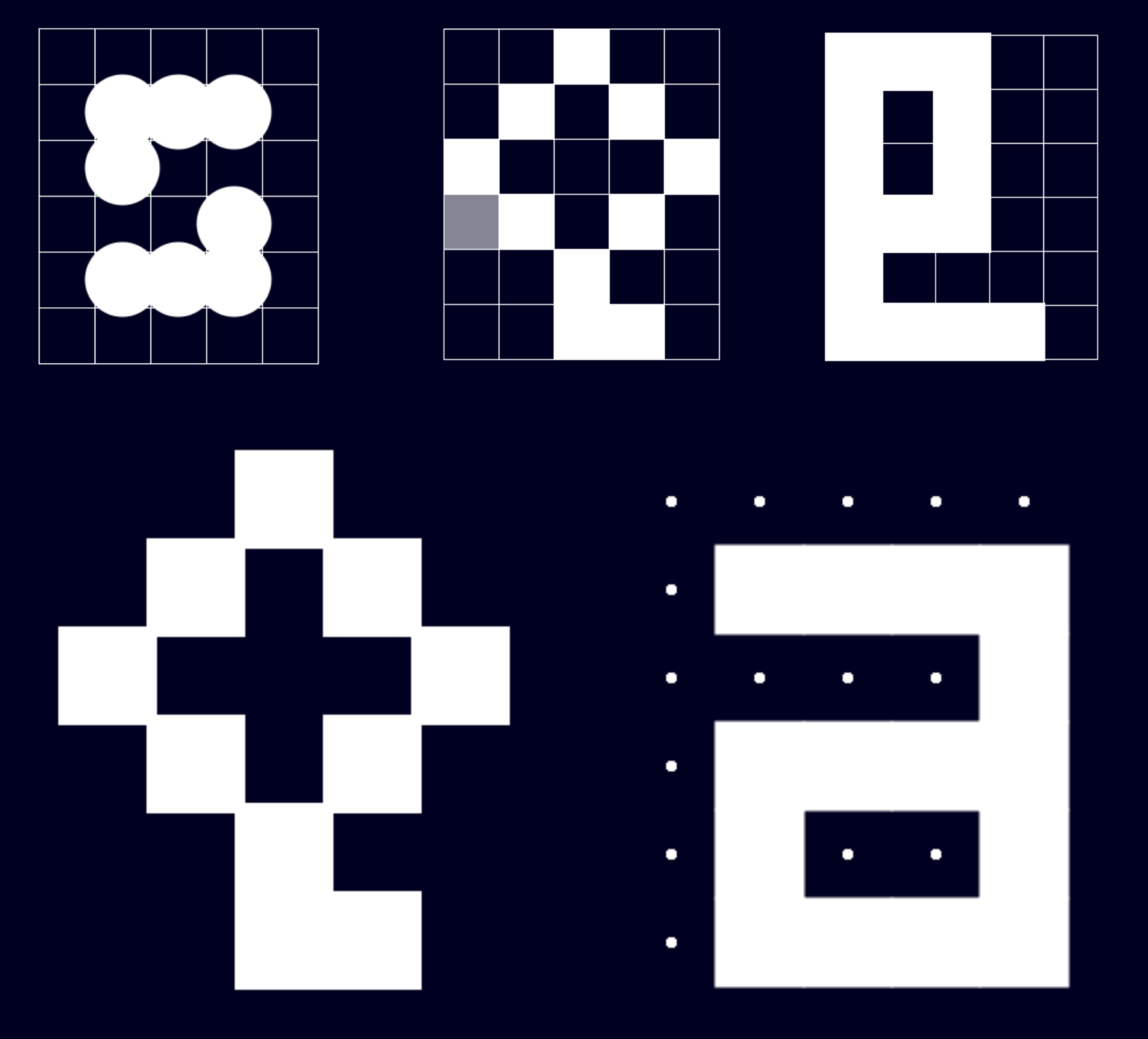
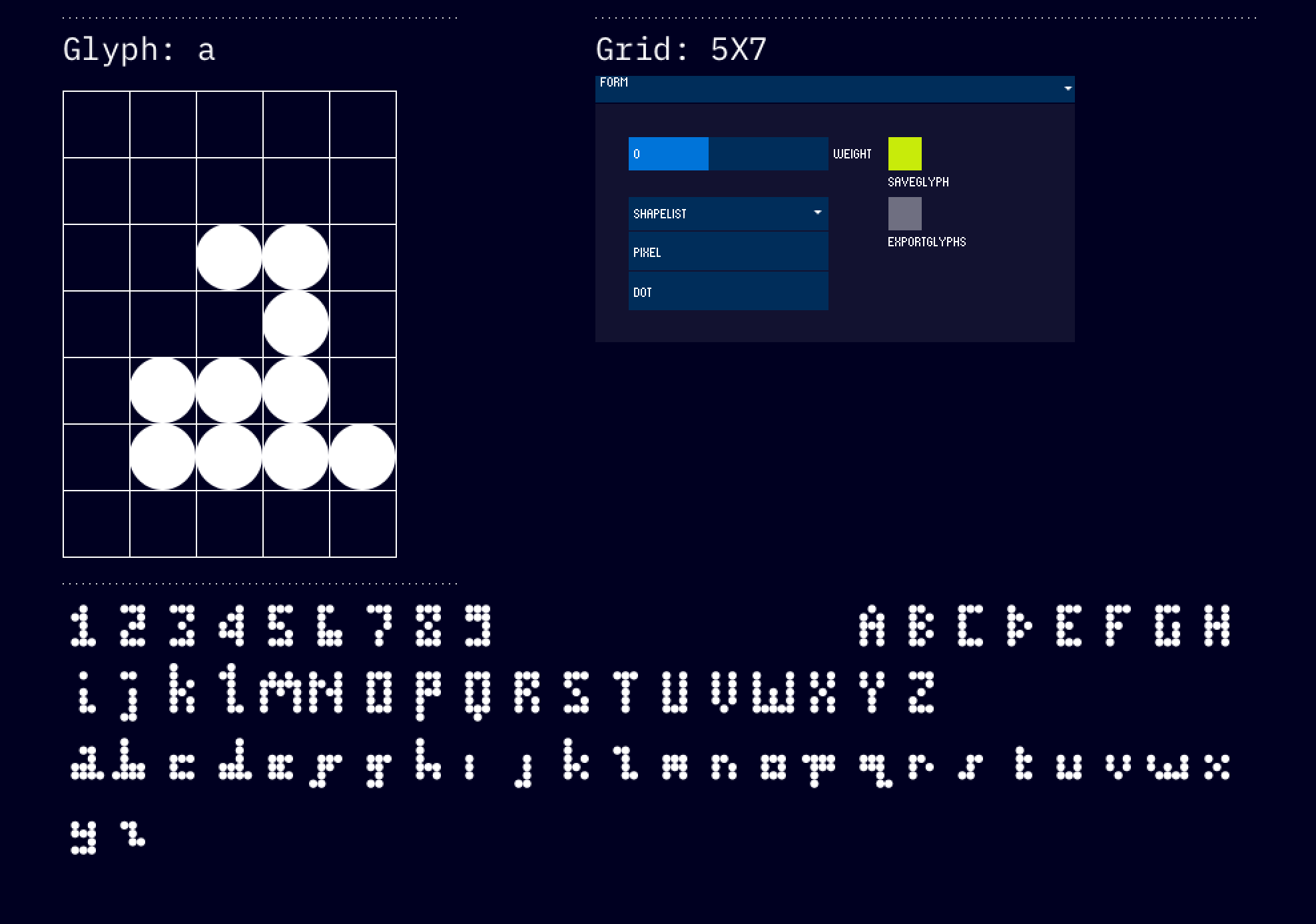
The image to the left shows some early experiments in bitmap font design. A simple program was written that enabled the creation of a grid and the ability to activate/deactivate cells, displaying two simple shapes; a square or a circle. We wanted this tool to be minimal in design and extremely simple to use. At this stage we were looking at letter form as a combination of shapes and not as a contruction of an outline as most traditional tools impose as a method.
“Cognition is recognition.” You see some lines as “an A,” you see a hunk of wood as “a table,” you see a meeting as “an emperor-has-no-clothes situation” and a friend’s pouting as “sour grapes” and a young man’s style as “hipsterish” and on and on ceaselessly throughout your day.”